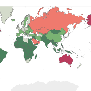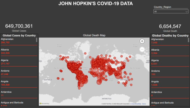
Embarked on a comprehensive COVID-19 analysis utilizing data from John Hopkins, culminating in the creation of a powerful and interactive dashboard using Power BI. This project aimed to provide stakeholders, healthcare professionals, and the public with real-time insights into the global pandemic, offering visualizations that capture the evolving trends, regional statistics, and the impact of preventive measures.
Key Points:
- Data Source: Utilized data from John Hopkins for accurate and up-to-date information on COVID-19 cases, recoveries, and fatalities globally.
- Dynamic Dashboard: Created an interactive Power BI dashboard featuring real-time updates, enabling users to explore COVID-19 data trends at various levels – global, regional, and local.
- Time Series Analysis: Implemented time series analysis to visualize the progression of COVID-19 cases over time, aiding in the identification of patterns and trends.
- Geographic Mapping: Integrated geographic mapping to provide a visual representation of the virus’s spread, helping to identify hotspots and areas with effective containment measures.
- User-Friendly Interface: Designed a user-friendly interface with intuitive navigation, ensuring that users, including non-technical stakeholders, can easily interpret and derive insights from the dashboard.